日本語
日本語 English
Tracing the evolution of sign design from postwar infrastructure to contemporary cultural practice, the exhibition reveals how information, space, and human experience are intricately connected
At Tokyo Midtown Design Hub, design is not presented as an isolated discipline, but as a civic language. Located in Roppongi, within one of Tokyo’s most active cultural and commercial districts, the Design Hub has long played a crucial role in connecting design with society through exhibitions, seminars, talks and educational programs. Its mission is not simply to display design, but to make it accessible: a place where professionals, companies, students and the general public can encounter design as something that belongs to everyday life.
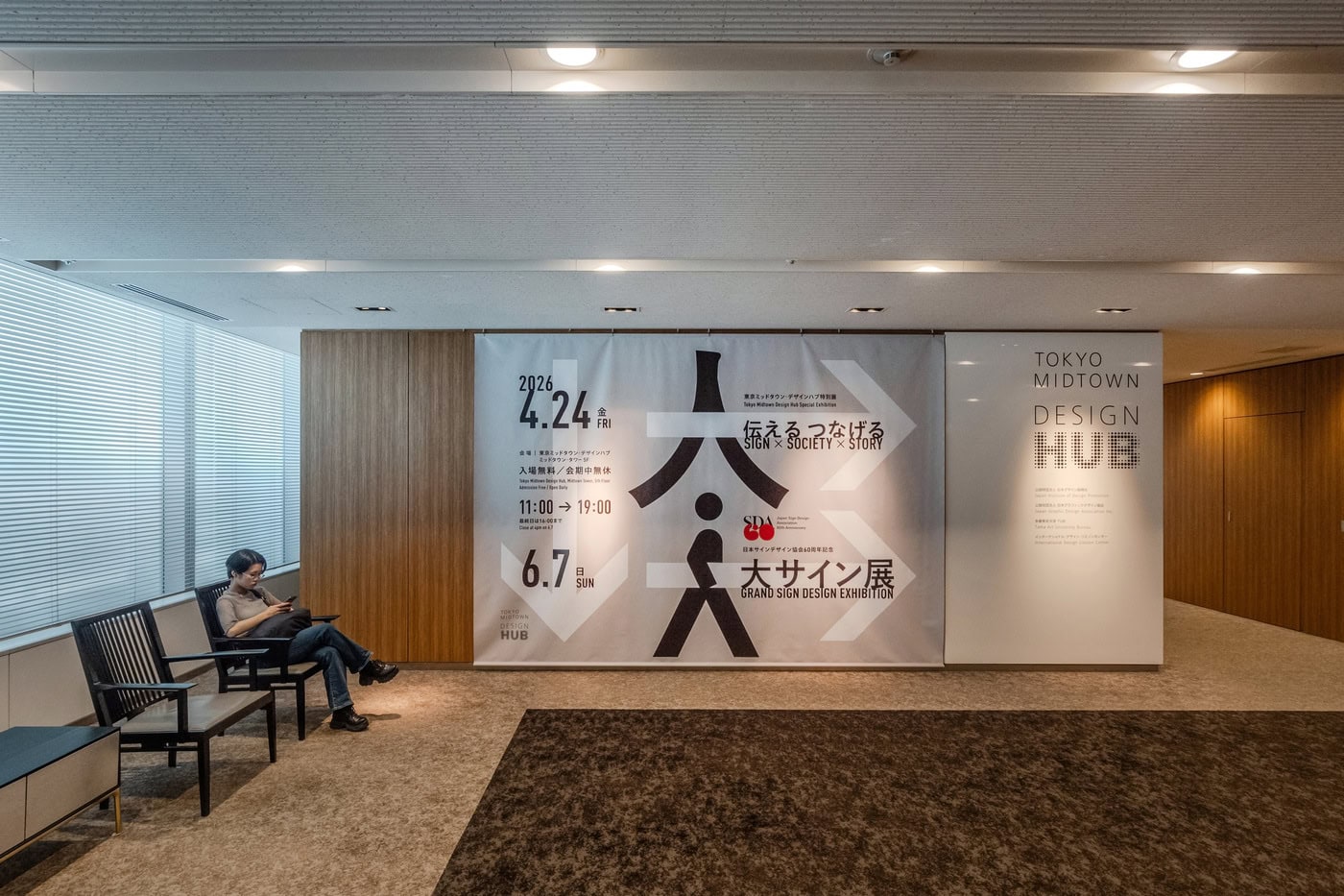
The exhibition Grand Sign Exhibition – Communicating and Connecting – Sign × Society × Story, organized on the occasion of the 60th anniversary of the Japan Sign Design Association, is therefore particularly well placed here. Presented as a special exhibition at Tokyo Midtown Design Hub from April 24 to June 7, 2026, it is described as the first exhibition in Japan dedicated to sign design, tracing the evolution of sign design across past, present and future. The exhibition begins from a simple but powerful premise: sign design is not limited to signboards. It is a form of environmental intelligence. It creates value through information.
Visiting the exhibition was unexpectedly stimulating. I have always been interested in the relationship between architecture, interiors, graphics and the way people inhabit space. Yet this exhibition made me understand more clearly how deeply graphic communication participates in everyday life. Many of the projects presented were familiar to me. Some I had seen in cities, stations, hospitals, offices, exhibitions or public spaces. But I had not fully understood their impact, their silent force, or the way they shape people’s behavior, emotions and memories.
A sign is often noticed only when it fails. When we get lost, when information is unclear, when a hospital feels intimidating, when a station becomes confusing, when a public facility excludes certain users, we suddenly understand the importance of sign design. But when it works well, it disappears into experience. This exhibition gives visibility to that disappearance. It invites us to look again at the systems we use every day without seeing them.
The title itself — Sign × Society × Story — is a concise manifesto. “Sign” refers to the visible and invisible systems that communicate information: letters, pictograms, colors, lights, forms, materials, spatial arrangements. “Society” indicates the field in which these signs operate: cities, institutions, mobility systems, cultural places, commercial environments, hospitals, public facilities and daily rituals. “Story” suggests that signs are never neutral. They carry histories, collective memories, values, identities and possible futures. A sign does not simply point to something; it constructs a relationship between people and the world.
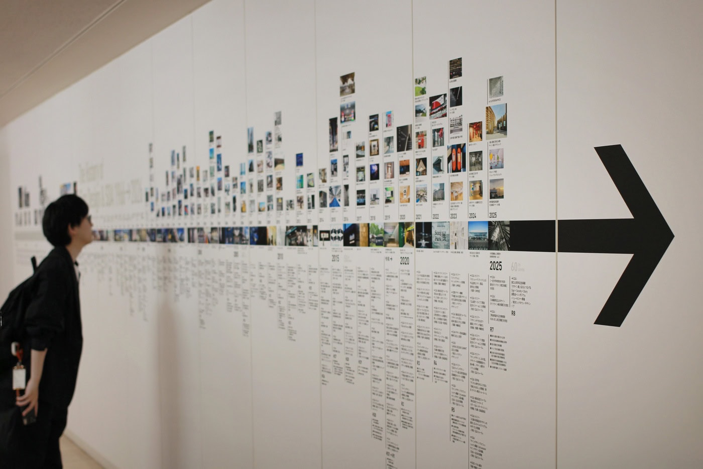
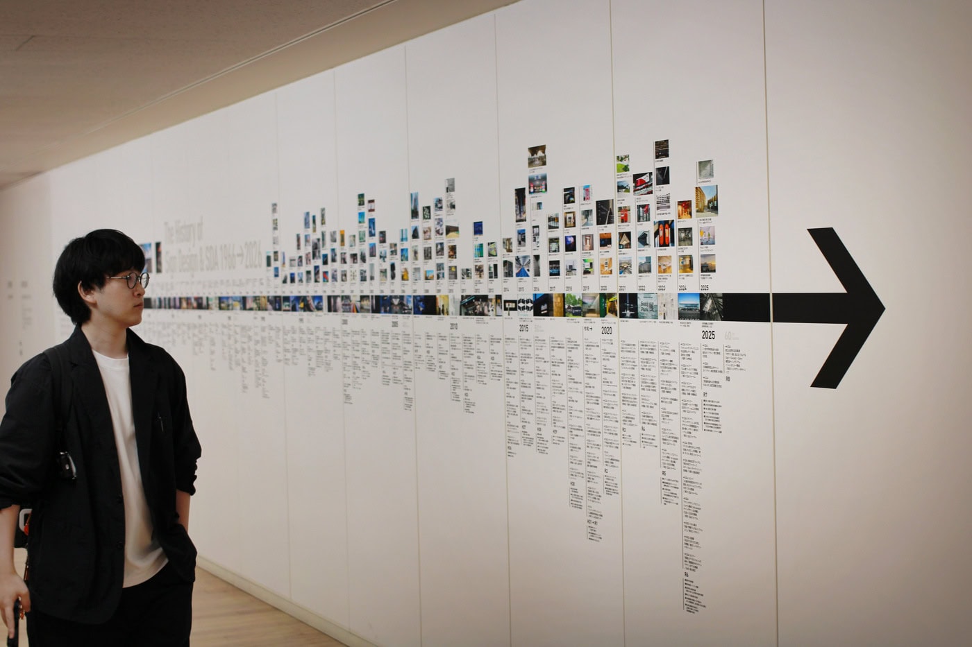
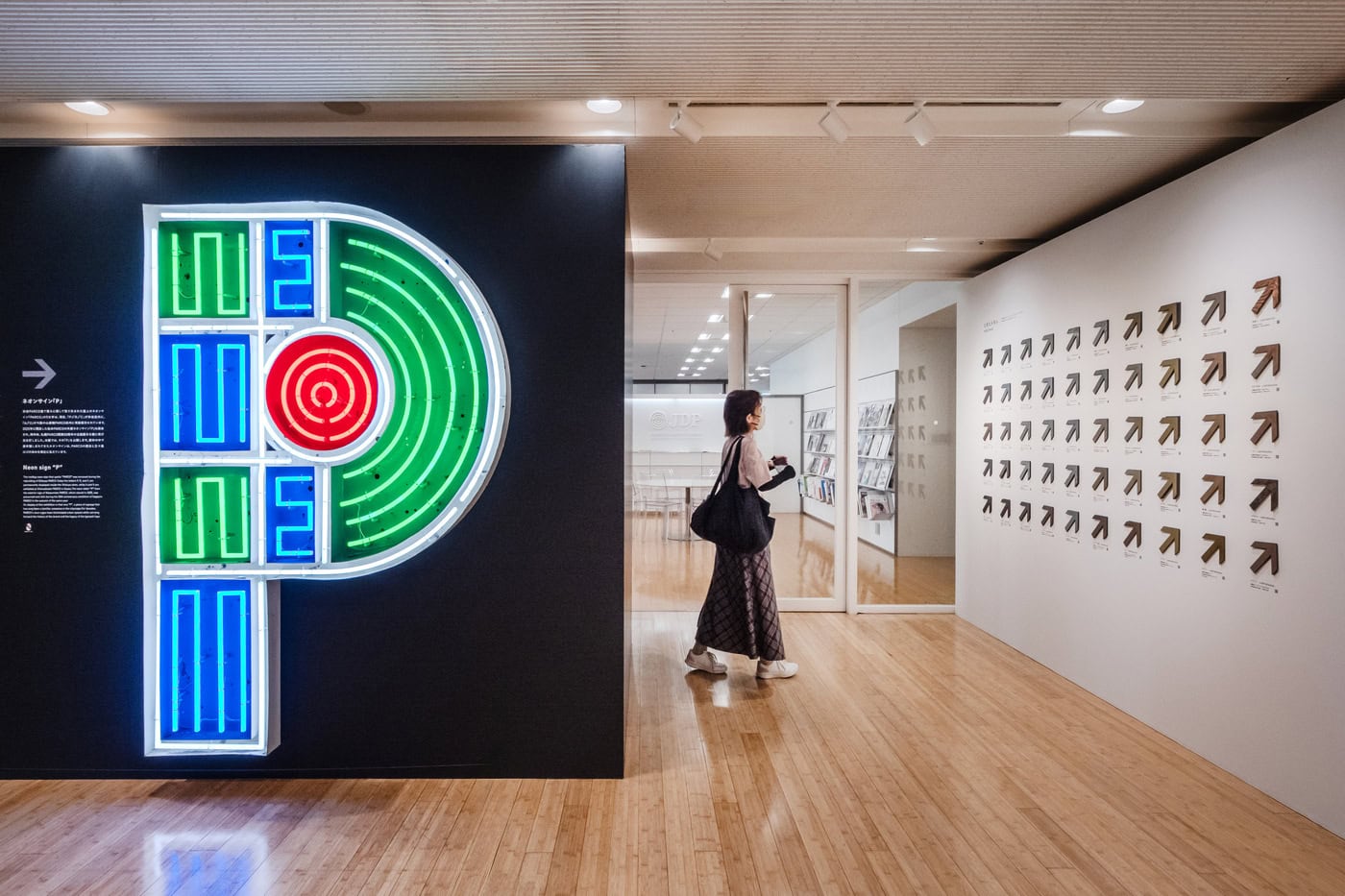
The exhibition’s introductory texts recall that the Japan Sign Design Association was founded in 1965, a period when neon signs illuminated Japanese cities and became symbols of postwar reconstruction. As high-rise buildings, highways, subways and airports expanded, signs became essential infrastructure, guiding large numbers of people safely and efficiently through increasingly complex environments. Over time, their function widened: signs began to shape urban landscapes, communicate local culture, support accessibility for elderly people and people with disabilities, and enrich everyday life as design elements.
This historical perspective is important. It reminds us that sign design developed alongside Japan’s modernization. It grew with mobility, density, public infrastructure and commercial culture. But the exhibition also makes clear that sign design is no longer only about orientation. It is about perception, materiality, atmosphere, identity, technology and narrative.
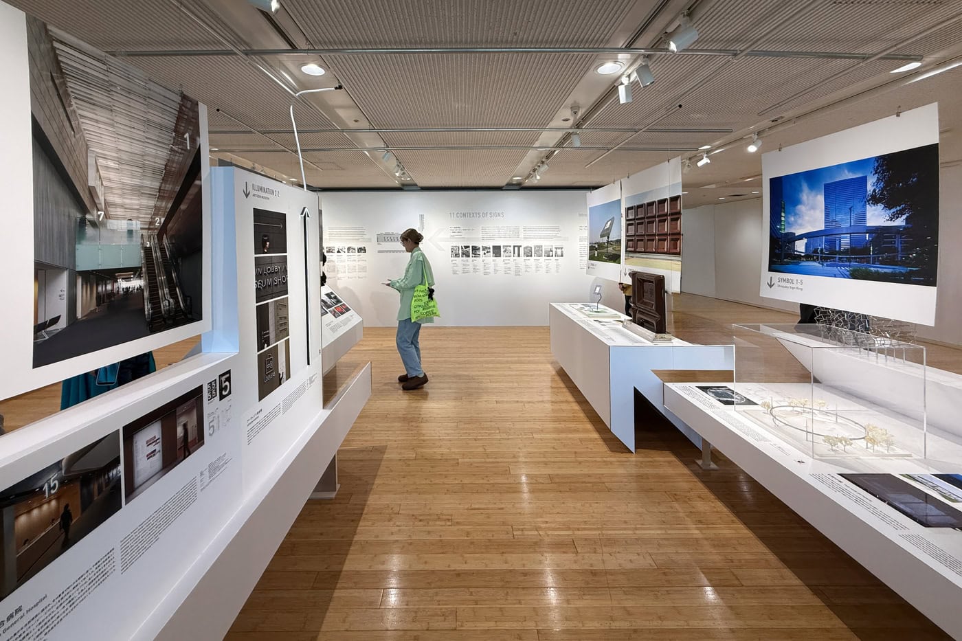
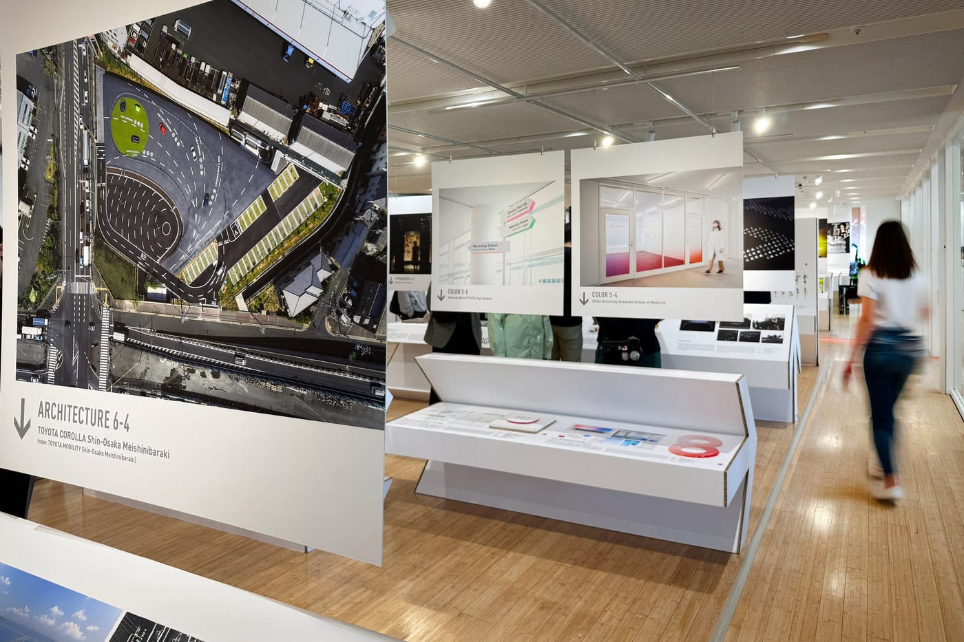
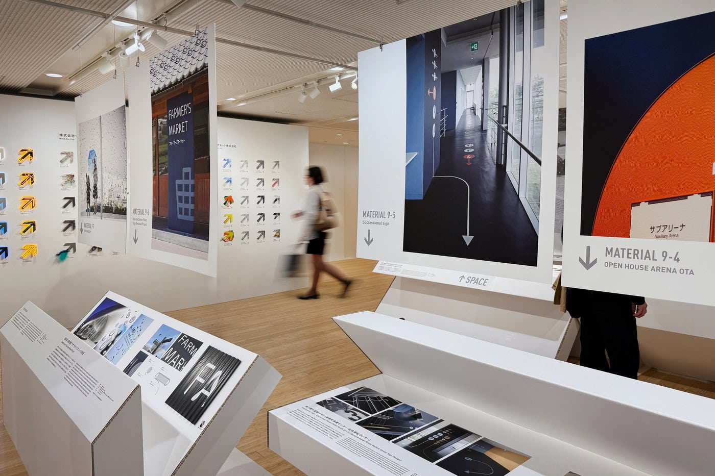
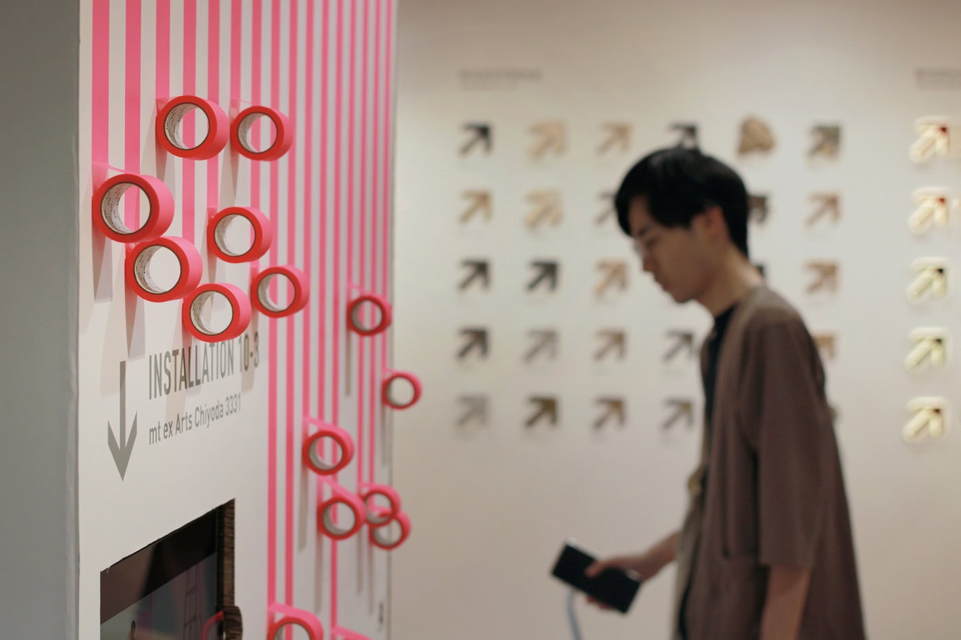
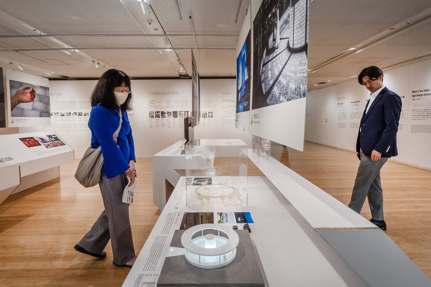
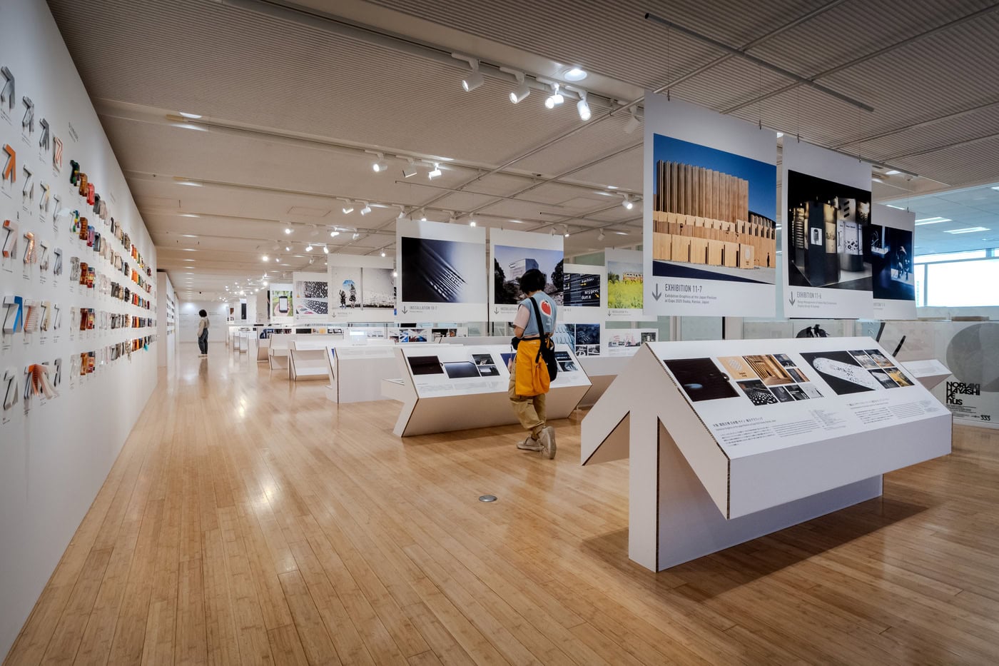
The structure of the exhibition is organized around eleven contexts of signs, selected through the perspective of the SDA and illustrated through 77 symbolic projects that have shaped the postwar period up to the present. This curatorial decision is effective because it avoids treating sign design as a technical category. Instead, it presents it as a cultural field with multiple dimensions.
The first context, “Signs Defined by Social and Cultural Meaning,” addresses the sign as symbol. A torii gate, for example, is not only a marker of entrance. It carries shared feelings of reverence, prayer and cultural memory. Its meaning is not produced by form alone, but by collective understanding. In this sense, sign design belongs to a deeper history of symbolic systems through which communities express values and organize experience.
The second section, dedicated to light, shows how illumination has always been a form of communication. From torches and lighthouses to traffic signals, neon and LED technologies, light transmits information across distance while also shaping emotion. In postwar Japan, neon signs gave cities a new vitality. Today, digital and LED systems have extended this field into dynamic visual communication, where information and atmosphere can change in real time.
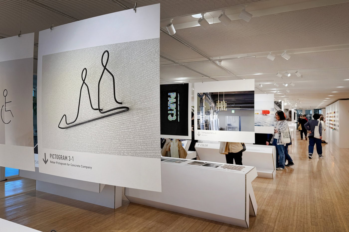
The third context focuses on pictograms as a universal visual language. This is one of the most powerful sections of the exhibition because it touches something we all use instinctively. Pictograms translate action and spatial information into images that can be understood across language, age and ability. The exhibition recalls their international recognition during the 1964 Tokyo Olympic Games, when graphic symbols became essential tools of communication in a global public event.
Among the projects presented, Dressing Pictograms is especially memorable. Toilet pictograms, often standardized to the point of invisibility, are transformed through cutting sheets and shadows cast by corridor lighting. By changing the graphics on each floor, the system reflects the diversity of people working in the building while introducing a playful, almost theatrical atmosphere. The project is small in scale but conceptually precise: it shows that even the most conventional sign can become a field of variation, identity and delight.
The fourth section is devoted to typography, described as the most highly systematized form of sign. Letters are visual signs that fix sound and meaning in space. They structure information, reproduce knowledge and reflect cultural worldviews. Typography, in this sense, is not merely a graphic tool. It is a cultural technology. In Japan, where multiple writing systems coexist, the relationship between typography, space and perception is particularly rich. The exhibition makes us aware that the character of a place can be influenced by the way language appears within it.
The fifth context, color, is introduced as one of the oldest signs in the history of life. Long before human language, organisms used color to communicate survival, attraction, danger or camouflage. Human cultures later transformed color into symbolic memory: red as power and celebration, white as purity, black as authority or mourning. This section is important because it reconnects design with biology. It suggests that before sign design becomes cultural, it is perceptual; before it becomes graphic, it is instinctive.
The sixth section, “Urban Signs Containing Purpose and Function,” expands the discussion toward architecture. Buildings themselves can function as signs. They communicate purpose, identity, status and use. A monument, a corporate headquarters, a hospital, a station or a museum all signal something before we enter them. Inside buildings, sign systems organize movement like a small city. For an architect, this section is particularly relevant because it shows that signage is not something added at the end of a project. It is part of the spatial logic of architecture.
The signage plan for The Pack Corporation is a beautiful example. The company works in packaging, and the designers used unfolded package layouts as the central motif. Package categories are transformed into icons for guidance signs, while expanded layouts cover walls and ceilings at the office and meeting room entrances. The project communicates the structural intelligence of packaging, the beauty of materials and the pride of the people who work with them. It is signage as corporate identity, but also signage as a form of craft storytelling.
The seventh context looks toward the future: signs in a world where information moves freely through space. Digital signage, mobile devices and navigation apps have transformed signs from fixed objects into dynamic systems. Information is now updated, personalized and distributed across networks. This section raises a crucial question: when the boundary between physical and virtual space becomes increasingly blurred, what will a sign be? A screen, a sensor, an interface, a behavior, an atmosphere?
The ROBOTICS SIGNAGE Development Project offers one possible answer. Eight robots move in coordinated choreography with video, transforming industrial technology into an experiential medium. Here, the sign is no longer static, nor even simply visual. It is kinetic, performative and emotional. It communicates through movement. The project suggests a future in which brand experience, robotics and environmental communication merge into new spatial languages.
The eighth section, “Signs That Interpret Space and Give It Meaning,” is perhaps the most poetic. It reminds us that signs are not only graphic or technological devices. They can be cultural codes embedded in space. The example of the Zen dry garden is particularly evocative: ripples of white sand suggest water where no water exists. A tome-ishi stone placed on a path functions not only as a physical barrier, but as a cultural sign that tells visitors not to proceed. These examples show that signs do not simply explain space; they allow space to be interpreted.
The ninth context addresses material. This is one of the most sophisticated parts of the exhibition because it challenges the idea that information is immaterial. A sign always has a body. Stone, wood, iron, glass, fabric, plastic, light, concrete, water or digital screens each carry different meanings. Heavy stone suggests permanence; fabric suggests softness and care; glass suggests transparency; light suggests presence and distance.
The Signage for Umeda Hospital illustrates this beautifully. Designed for expectant and nursing mothers, the signage is made of washable white cotton fabric. The choice of white, a material vulnerable to dirt, becomes a message of hospitality: its cleanliness communicates care. The comparison with a fine restaurant presenting a pristine table through a white tablecloth is particularly convincing. Here, the sign does not only inform. It reassures.
Another powerful example is the Fukushima RDM Center, the research and development hub of a concrete company in Namie, Fukushima, an area damaged by the Great East Japan Earthquake. The signage uses reinforcing bars embedded in concrete walls, which protrude outward to form pictograms. A single bent rebar expresses both flexibility and strength. This is not graphic design applied to architecture; it is the material identity of the building becoming information.
The tenth section is dedicated to ephemeral signs: installations that exist only temporarily in a specific place and moment. Festivals, exhibitions, events using light and sound — all these temporary systems condense meaning precisely because they disappear. Their power lies in the feeling of “only now.” This is a useful reminder in an age obsessed with permanence and documentation. Sometimes the strongest sign is the one that belongs to a moment.
Visible Motion, designed for an Aisin Seiki exhibition during Milan Design Week 2017, is a striking case. The installation expresses the presence of an automobile not by showing the car itself, but through the beauty of its driving trajectory. A tire’s contact surface appears three-dimensionally in a large water basin, drawing arcs across the surface. Mobility becomes visible through motion alone. It is a sign of absence, or rather a sign that reveals the invisible trace of movement.
The eleventh and final context considers signs as the framework for designing intellectual experience. In exhibitions, museums, libraries and galleries, signs are not supplementary labels. They shape the way knowledge is encountered. They organize movement, clarify relationships, support interpretation and frame attention. An exhibition is itself an information system. This section resonates strongly with the exhibition as a whole, because Grand Sign Exhibition is not only about sign design; it is an example of sign design.
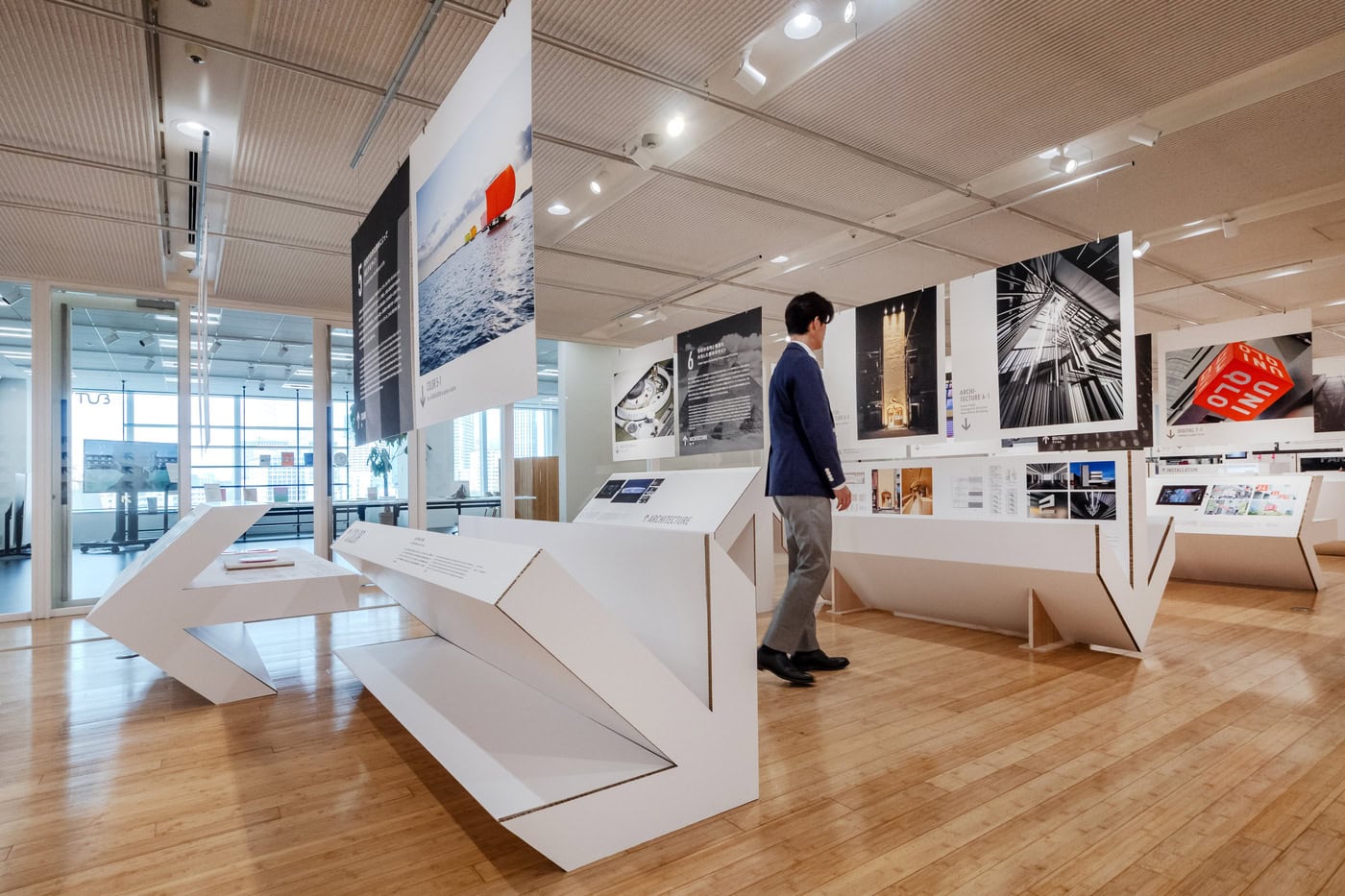
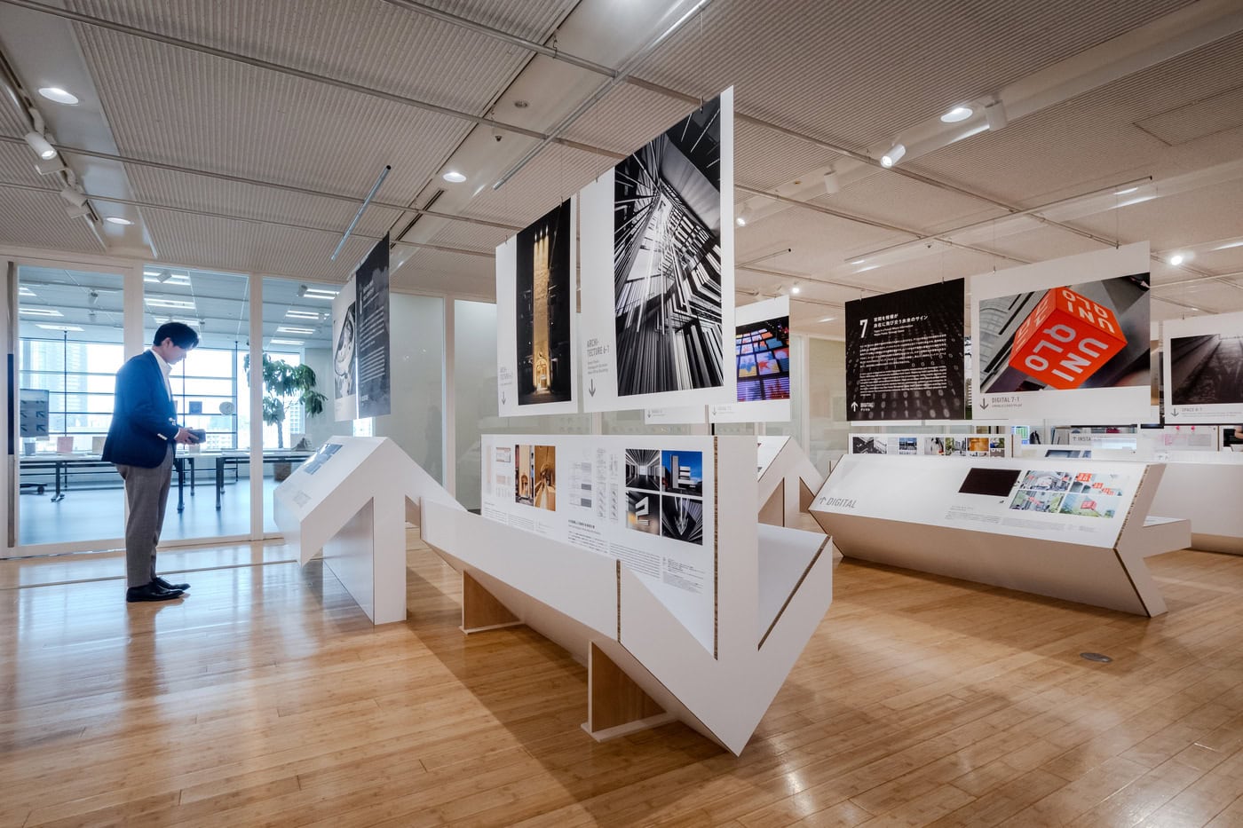
The design of the exhibition itself is one of its most interesting achievements. The installation is built around the motif of the arrow, using honeycomb cardboard as the main material. The arrow becomes both a graphic symbol and an architectural device. It is a sign, an object, a support, a display element and a spatial organizer. Depending on its rotation, the arrow changes function and appearance: it can point, hold, divide, frame, guide or become a surface. This simple operation gives the exhibition a coherent identity without becoming monotonous.
The choice of honeycomb cardboard is also significant. It is light, economical, structural, recyclable and visually direct. It gives the exhibition a temporary but precise character, somewhere between industrial material and graphic abstraction. The scenography does not compete with the projects; instead, it makes the logic of signage physically present. Visitors move through a landscape made of arrows, constantly reminded that direction is never neutral. To point is already to design a behavior.
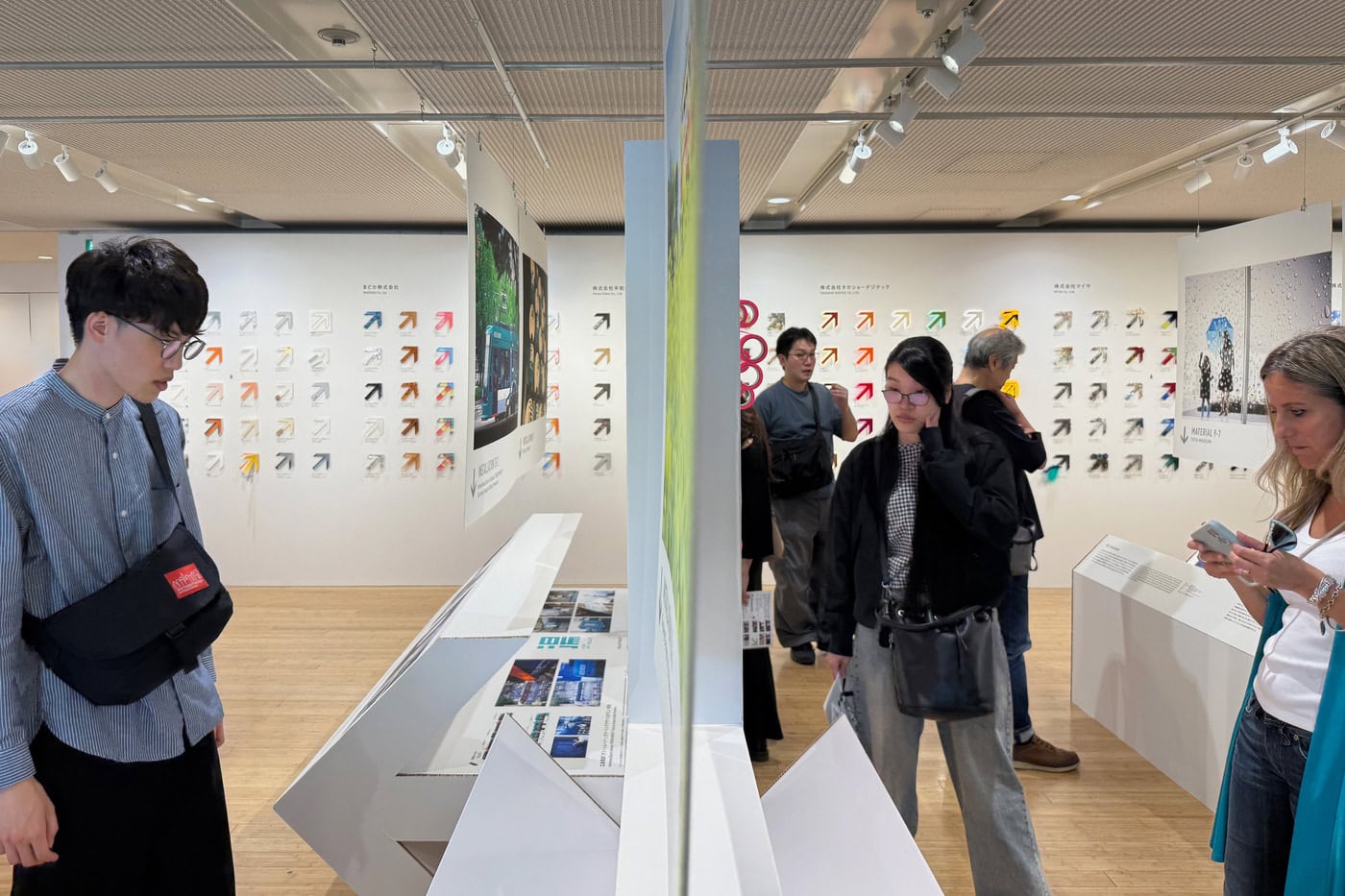
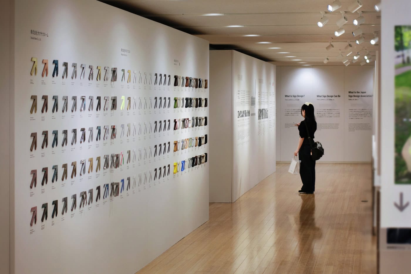
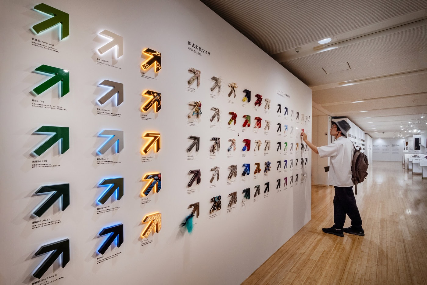
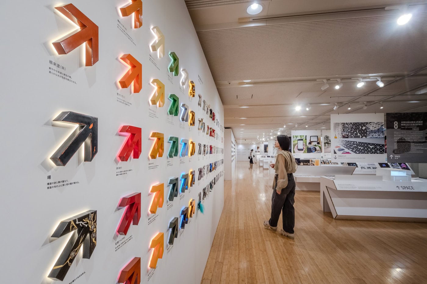
The section titled “Material-tone” extends this idea into a wall installation of 380 arrow-shaped signs, all sharing the same form but interpreted by ten companies involved in the sign industry. This is one of the most memorable moments of the exhibition. By repeating the same arrow, the display isolates material variation as the main field of expression. The arrow remains constant, but its meaning changes through surface, texture, technology and fabrication. The result is almost musical: a single motif repeated in different tones.
This installation reveals something essential about sign design. Meaning is not produced only by message or shape. It is produced through the encounter between form, material, process and perception. The same arrow can feel industrial, warm, technological, fragile, luminous, heavy, precise or playful depending on how it is made. The wall becomes a catalogue of possibilities, but also a tribute to the manufacturers, technicians and designers whose experiments often remain invisible behind finished signs.
Several other projects in the exhibition expand this idea of sign as experience. The dynamic identity of TV Asahi, introduced when the company relocated to Roppongi Hills in 2003, is especially interesting because it anticipated contemporary ideas of responsive branding. Instead of a fixed logo, multiple elements react in real time to environmental sounds and other stimuli, generating endlessly changing imagery through a computer program. The logo becomes a living system, an identity able to move and transform like the media company it represents.
The Water Logo for TOKYO FIBER-SENSEWARE is equally poetic. Using super-hydrophobic fabric, luminous droplets form the word “SENSEWARE.” As the droplets grow, they roll downward and new ones appear, allowing the letters to be continuously redrawn by water. It is a sign made of instability. The message exists only through material behavior. In this project, technology does not become cold or abstract; it becomes almost natural.
The Nicolas G. Hayek Center project offers another subtle and memorable example. Rather than presenting a conventional sign, it creates a clock floating in space. A small projection from the ceiling becomes clearly readable only when it falls onto a hand or palm. Time appears when the body enters the sign. Communication is completed through gesture. This is a beautiful reminder that signs do not exist only to be looked at; they often require participation.
What makes Grand Sign Exhibition particularly valuable is that it restores dignity to a field too often misunderstood as secondary. Sign design is sometimes seen as a layer applied after architecture, interior design or urban planning. This exhibition argues the opposite. Sign design is one of the ways in which environments become usable, legible and meaningful. It is both infrastructure and culture.
For designers and architects, the exhibition is also a lesson in humility. It reminds us that the quality of a space is not only determined by form, material or proportion, but by the clarity of relationships it creates. Can people understand where they are? Can they move without anxiety? Can they recognize a place? Can they feel welcomed? Can a building communicate its identity without shouting? These are design questions as much as architectural ones.
For the general public, the exhibition offers another discovery: the city is full of messages. Some are explicit, others almost invisible. A pictogram, a color, a light, a fabric sign in a hospital, a rebar pictogram in a concrete building, a dynamic logo, an arrow in cardboard, a temporary installation, a torii gate, a projected clock on a hand — all belong to the same expanded field. They help us decide, move, understand, remember and feel.
After visiting the exhibition, I found myself reading Tokyo differently. Station signs, shop signs, arrows, logos, floor guides, emergency signs, temporary event graphics, elevator numbers, restroom pictograms, construction barriers — everything became part of a larger visual ecology. The exhibition sharpened my perception of the ordinary. It showed that graphic design is not confined to paper or screens. It is embedded in architecture, bodies, movement, rituals and memory.
In this sense, Sign × Society × Story is more than an anniversary exhibition. It is a necessary cultural reflection on how design connects people to environments. It celebrates sixty years of the Japan Sign Design Association, but it also opens a question for the future: in a world increasingly saturated with information, how can signs remain clear, humane and meaningful?
The answer suggested by the exhibition is not simply technological. It lies in the careful integration of society, material, space and story. A good sign does not only communicate information. It understands the people who will receive it. It respects context. It gives form to invisible relationships. It transforms complexity into experience.
And perhaps this is the true lesson of the exhibition: signs are not minor elements of design. They are among the most intimate ways in which design enters daily life. They are there when we search, when we wait, when we move, when we arrive, when we hesitate, when we understand. They accompany us quietly, but they shape the world we live in.