TALKING ABOUT THE “SIGNAGE”
The alignment and balance between texts and images, the right fonts, legibility, suitable materials and other details are the foundation of an excellent graphic design. Respecting those rules is a duty. Sometimes following the rules seems tedious, and a pinch of madness could help to create more attractive graphic works.
If you follow all the rules, you miss out on all the fun.
Katharine Hepburn
Nevertheless, the quote mentioned above is not always valid. Fun is welcome, but without forgetting the fundamental dictates of graphic design. Sometimes, incorrect graphics can ruin an exciting project, such as the signs inside some buildings. The success of a project is not only related to its concept and realization but also to those small finishing touches that make it up.
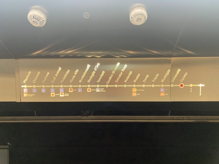
I recently found myself in a similar situation. I admired the beauty of Naples station - considered among the most beautiful in the world - and a small detail led me to provide incorrect information to some tourists. The arrow indicating the train’s direction was illegible. It was too small, not well highlighted, too high up and its lighting did not facilitate its readability.
An interesting text by Silvia Imbesi - Ph.D. student at the University of Ferrara (ITALY) - explains:
A good wayfinding project must make the place immediately interpretable. Also, making instantly familiar a site that is not, as a caring but a discreet guide who puts you at ease, help that does not make you overthink but that leads you without stumbling to your destination.
The wayfinding must be well designed, well-positioned, and well lit. A good view - in any position and at various times of the day - and the effect of light can be decisive. In the case of interior signs, using direct light creates original effects, enhancing the creativity of the design. For outdoor signages, instead, it is essential to consider the effect of night lighting.
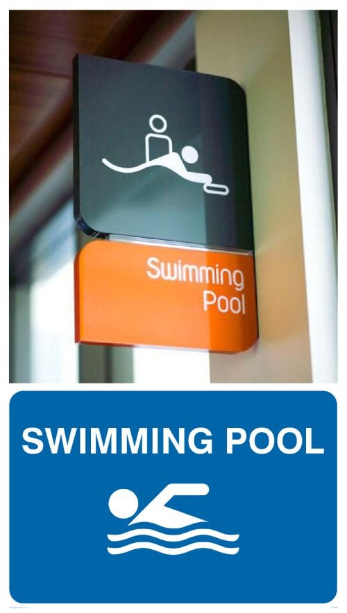
Being too creative can sometimes have a negative outcome, for example, making a sign incomprehensible. During my research, I came across what I thought was a massage room. Try to imagine the meaning of this signage.
This is the signage for the swimming pool in a hotel. Is it creative? No, it is misleading. Simplicity often rewards more than inspiration. The classic symbol of the man swimming - simple, clear, and direct - is easier to understand.
Particular attention should be paid to the proportion of the signages. If too big, it becomes annoying and not so elegant. If too small can become unreadable. Let's take the bathroom signs, for example, men, women and disabled. Usually, the symbol of the disabled person is proportionate - considering the height of the person sitting on the chair - but in many cases the sign is smaller. It looks pretty discriminating.
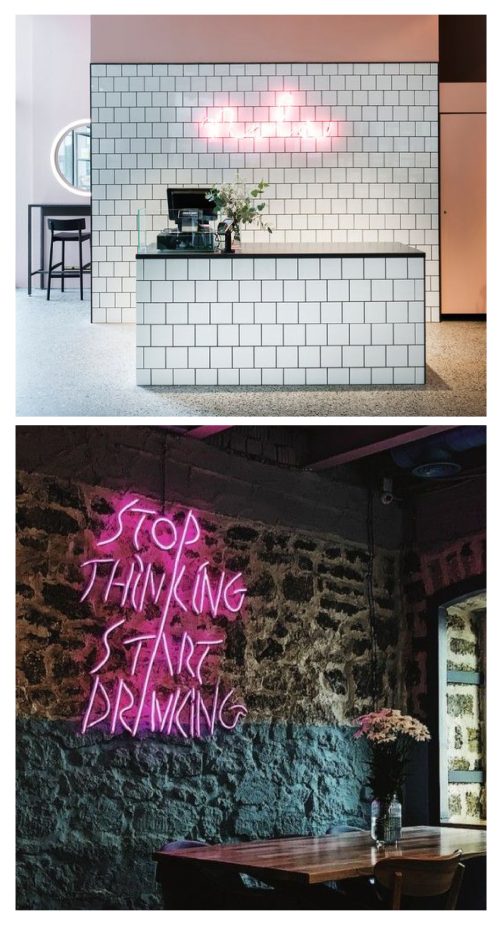
Readability is one of the critical points for the correct usage of signages. Using suitable fonts and materials is one of the secrets. Proper lighting is also essential. For example, using neon lights is not easy. It does not help its reading on white surfaces, but it has a more practical effect if used on dark or colored surfaces.
Avoiding clashing colors but accentuating the contrast makes everything much more captivating.
A combination of complementary colors, such as yellow or purple, relieves color disharmony and clarifies words.
Using creativity for graphic design is not difficult. On the other hand, creating pleasant and efficient signage can be a rather complicated operation. Following the rules, with a simple approach and a pinch of creativity, can lead to excellent results. To quote Ludwig Mies Van Der Rohe: “Less is more.”

 日本語
日本語 English


