English
 日本語
日本語“The color is the best way to express ourselves.”
These are the words from Elley Cheng, Vice President and General Manager of PANTONE COLOR INSTITUTE, during the launch of THE COLOR OF THE YEAR.
Each of us, in fact, chooses a color to identify her or himself. We use our favorite color to decorate our house or wear it in many ways. Thus, the color is an actual VISUAL LANGUAGE. The PANTONE color is considered not just a color but a statement.
From architecture to graphics or fashion, the creatives wait for the announcement of the “COLOR OF THE YEAR” from the PANTONE COLOR INSTITUTE to create new interiors, furniture, or fashion collections. For 2023, the Institute's experts selected the color “VIVA MAGENTA”.

Courtesy of Pantone
Through the years, I discovered how the PANTONE color affects many fields, and several questions came to mind. What does PANTONE mean? Why does the PANTONE COLOR INSTITUTE exist? What is the brand that creates its PANTONE, and which is the meaning behind it?
Let’s start with the meaning of the word PANTONE: “every color” from the Greek “PAN” – everything, whole – and the English “TONE” – color, shade.

Courtesy of Pantone
The PANTONE COLOR INSTITUTE was founded in the 1960s by Lawrence Herbert and is now directed by Leatrice Eiseman. The institute has developed a system called PMS - Pantone Matching System - to standardize colors, using a numerical method to identify each color, thus allowing for uniform color matching. This system, which includes over eighteen hundred colors, will enable creatives to communicate color choices while ensuring that the final product has the desired color.

Courtesy of Pantone
The "VIVA MAGENTA", a powerful and inspiring color, was born from a deep analysis of the people’s state of mind during the suffering of the pandemic. It represents the desire and the courage to react, to be joyful and optimistic, a color that gives the strength to start over with positivity.
Including in the RED family, “VIVA MAGENTA” gets those attitudes from the two primary colors used to create it: RED and BLUE. In the color’s symbology, RED means courage, power and passion and BLUE means calm and peace.

Many brands also create their PANTONE to identify themselves and the story behind them. Several examples come up, like ROSSO VALENTINO's “PANTONE 2035”. The color, made by the Italian stylist VALENTINO GARAVANI, reflects the blazing and is full of passion. An exciting story backward this color that fascinated him from an early age. He was attending a show at the Opera in Barcelona and suddenly found a woman wearing a red dress. She was terrific, wrapped in that color, and in a late interview, VALENTINO said:
Among all the colors worn by the other women, it seemed unique, isolated in its brilliance.
I've never forgotten it. I think a woman in red is always wonderful.
She is the perfect image of the heroine.
The ROSSO VALENTINO color is pure red with a touch of blue. It is intense and smooth and seems to meet the brilliance of cardinal red.
For the new F/W collection 2022, the Italian atelier VALENTINO with the Italian designer PIERPAOLO PICCIOLI, collaborated with PANTONE INSTITUTE COLOR to create a new shade of pink called “PINK PP.” This color attenuated the shock of the pink color, allowing the individual's personalities to burst forth, along with their features: “the signs that shape them into a silhouette, the textures that give them consistency, the decorations that are part of the construction.”

Courtesy of VALENTINO
Throughout the years' many colors became famous like the brand itself. An example is the BLUE TIFFANY - also called robin's egg blue - of the American brand TIFFANY&Co. Registered in 2001 with the name “1837 BLUE”, it is a custom-made blue, even though many people mistakenly call it green tiffany. It is realized with the shade of blue and cyan. It seems the origin of color came from an ancient tradition of the Victorian age. In the 19th Century, Turquoise was a favorite of Victorian brides who gave their attendants a dove-shaped turquoise brooch as a memento of their wedding day, which increased the color's popularity.

Courtesy of TIFFANY&Co.
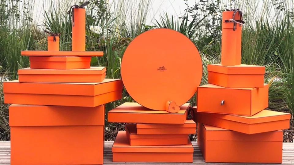
Another example like this is the “PANTONE 1448”, the captivated orange of HERMES.
The story of this color is quite singular. Initially, the French Maison's color was identified as beige, then changed to mustard. During the Second World War, finding the material to create the Hermes boxes and palettes was difficult, and the only available color was orange. Thus, the orange casually became the emblematic symbol of the Maison.
Courtesy of HERMES
Modest and stylish, the greige color - composed of beige and grey - was chosen by King GIORGIO ARMANI. The color “PANTONE 16-1109 TCX” is simply timeless and has contemporary elegance. The greige is like a background color that accompanies all the other nuances. In an interview, ARMANI declared: “I was looking for a shade that was warm but at the same time metropolitan, sober but not obvious. And greige is all of this for me: discreet, sophisticated and natural. I love natural colors, they give a deep sense of tranquility and serenity, and they are a basis on which anything can be built.”

Courtesy of GIORGIO ARMANI
Those are just some of the colors registered in the PANTONE COLOR INSTITUTE.
Every color comes from experimentation, research, deep knowledge, and the perfect combination of the above. Colors help us define our soul and discover ourselves.
What is your color, the one that makes you feel unique and happy?