A beautiful face is mainly attractive because of its bone structure proportions that define the outlines of the external skin and the ratios between its features
The human body is a relevant example of the conception of beauty. What is the primary key that makes a face beautiful or an appealing body?
A beautiful face is mainly attractive because of its bone structure proportions that define the outlines of the external skin and the ratios between its features. Likewise, a building may look enticing –even when it is bare– when, for instance, a specific opening distances itself suitably and balances another space in a “way that we can’t explain.”
But perhaps we can. When we delve into the matter and give it the gift of more profound thought, we may notice the magic that geometric ratios impose and the magnetic impact it has on our eyes.
Relativity –where and how something is positioned in relation to its neighboring element– is vital to design. The ideal result is a harmonious relationship between all the contributing features that pull most witnesses towards enjoying the final product as a favorable snap judgment of the whole rather than liking a few elements here or there. Instead of comparing the parts, one transcends into the tuneful grand image.
A bulging glass cube, for instance, wouldn’t have been as attractive had the empty wall beside it wasn’t well-directed and had the separating gap not been demonstrated.
What we mentally mark as a beautiful product doesn’t coincidently merge to become that way. While some masters can and do end up with an ability to judge a good ratio with their trained eyes with no need of any reference, they are –most of the time– bonded by a guideline that has proved its validity. That is not to say that absence of harmony isn’t utilized at times and may also be a statement in and of itself.
From where did that guideline come?
Instructions ascended from curious studies regarding the proportions of things past seekers found appealing in nature: our first source of inspiration. That has led to a prediction of an objective visual measure and resulted in an integrated systematic path out of the aesthetic argument.
Mathematics got invited into the visual picture to proclaim a way to construct an objective platform for aesthetics. The Fibonacci sequence, for example, found 1.61803 as a golden scale value. Even Aristotle noted that beauty is to “maintain the just measure.”
Traditional architecture –mainly prevailing in religious buildings– has put an unmatched effort in proportion compared to other institutional facilities. That is evident due to the lack of glass walls in the grand architecture of the past. Today, though, we find that glass is increasingly ingesting the buildings, stripping away the architectural identity and the culture it occupies.

The vertical repetition of dividers leads your attention into an alluring void, though identity is lacking - Image: no attribution required
Talented graphic designers reveal an exceptional understanding of proportion, relative size, and scale. That understanding is often intuitive and kindled in the master’s creative soul as he pursues his passion. Thus, if you ask that master how he generates a piece of art, the answer would be nearly impossible to explain. That is simply because the magic happens in the process of the project’s evolution and is accompanied by an extreme awareness of proportion and scale as the design progresses and the elements are gradually supplemented. The editing keeps recurring until the master reaches a point where adding or eliminating anything else seems to be pausing harm to the entire combination of elements. The master may then stack his design away from sight. Hours later, or perhaps the next day, he approaches the work only to see it from a different lens. Further modifications occur, and the pattern repeats itself until soon the master takes a peak after revisiting the piece, and feels a favorable one-second snap judgment of his own work. His guts have finally confirmed.
Japanese masters of design also divulge their appreciation of balance in their arts (Sumie, Zen landscaping, etc.). An example could be when a small stamp on a lower left corner of a rice paper exquisitely balances a brush stroke on its upper right corner, leaving a space in between that allows an appreciation of the few existing elements.
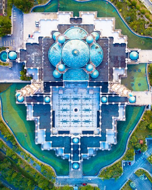
Islamic art also expresses that balance in geometric abstractions: polygons.

One square and four circles can produce much more than that. Soon enough, along the repeating progression, one stops realizing the circles and squares in the first place - Image: no attribution required

The architectural abstraction revealed in Louvre Abu Dhabi in the United Arab Emirates - Image: no attribution required
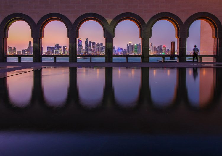
The Museum of Islamic Art in Doha, Qatar, borrowed the vast proportion from the Doha skyline and framed it beautifully within alluring arches in the scenery above. The juxtaposition between the vast skyscrapers collected within a few small arches makes it a meditative view.
Designers need to check their awareness regarding the proportions they use. How do they utilize balance in the asymmetry of functions? How much spacing do they leave between elements, and why? That awareness could be the difference between an amateur designer and a professional.

 English
 日本語
日本語


