English
 日本語
日本語Oikoa, Design theme using a post treatment "liquid" motif
A new massage boutique, Oikoa in Zwolle (in the east of the Netherlands) has opened its doors. concrete designed the interior and the graphic identity, and the name Oikoa is all about inner self and wellbeing. Oikoa, the Finnish word for ‘smooth correction, provides an introverted realm of calm. A place that invites you to leave the outer world behind, and to recharge in a natural and harmonious
environment.
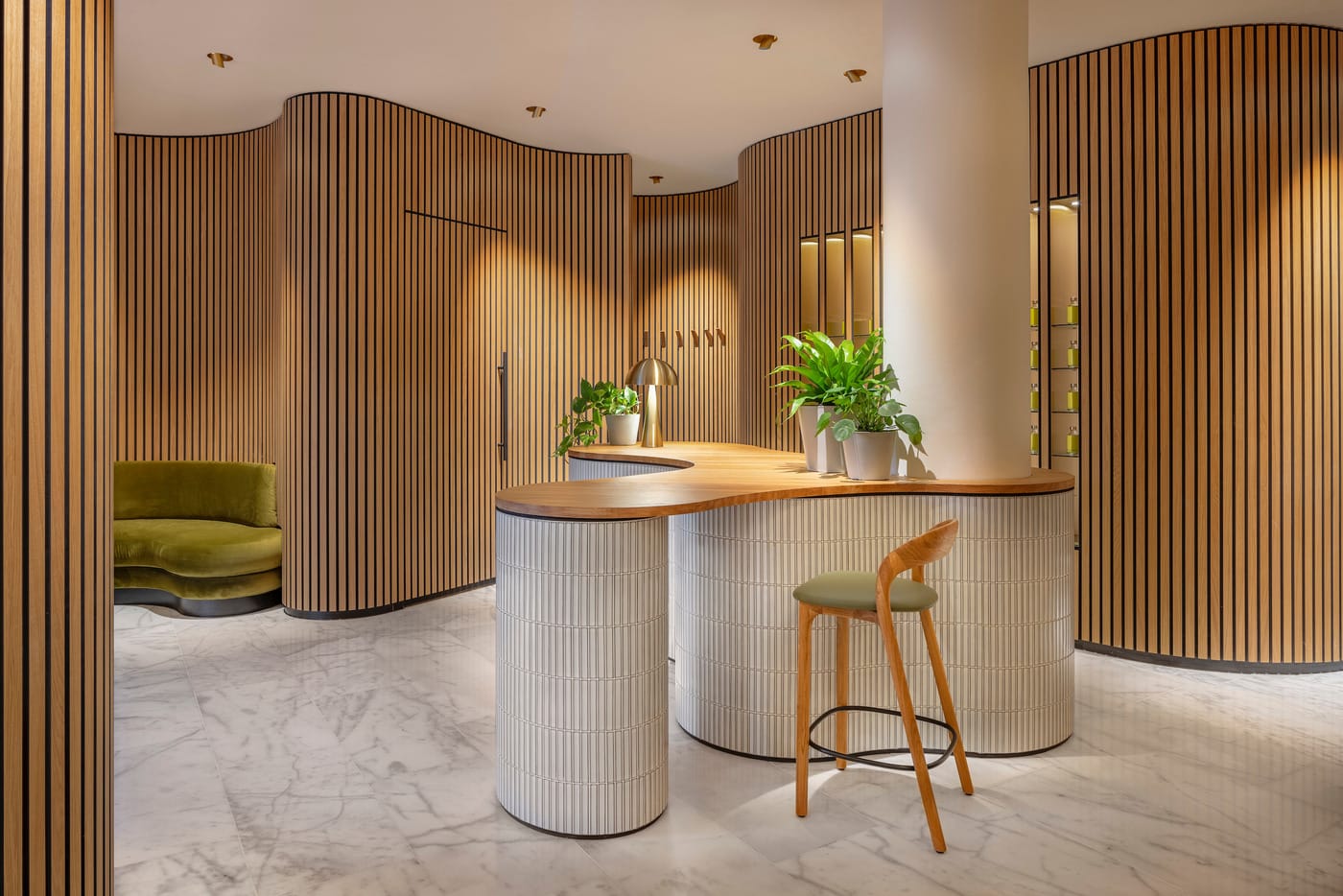
Photo credit: concrete - wouter van der sar
A new massage boutique "Oikoa" in Zwolle (in the east of the Netherlands) which concrete designed the interior and the graphic identity has opened its doors. Oikoa, the Finnish word for ‘smooth correction, provides an introverted realm of calm. A place that invites you to leave the outer world behind, and to recharge in a natural and harmonious environment.

Photo credit: concrete - wouter van der sar
The massage boutique is designed as a serene space where guests can focus on themselves. This was achieved by turning the existing extroverted glass cube inside out and placing the organic-shaped central space at the heart of the building, with the treatment rooms situated on the perimeter.

Photo credit: concrete - wouter van der sar
Guests enter directly into the core of the boutique; a warm introspective space lined with multiple curved walls, finished in warm oak laths. The curved walls create intimate seating areas, with softly curved benches upholstered in moss green velvet. These are the perfect spots to wait in full comfort and prepare for treatment.

curved walls: oak laths on black background wall tiles Photo credit: concrete - wouter van der sar
In addition to the interior, concrete is responsible for the identity of Oikoa, including the name, logo, website, and all print materials.

Photo credit: concrete - wouter van der sar

wall tiles: rectangular tiles: sevilla kit kat fingers in green speckle
concrete also came up with the name Oikoa, the Finnish word for ‘smooth correction’, based on the feeling of calm one gets after a treatment when the body is untangled and almost feels ‘liquid’. This feeling is reflected in the logo: a liquid oil drop combined with a minimalistic but elegant font. Bright white backdrops and pine green emphasize the natural and harmonious environment of the massage salon, which is further enhanced by a secondary colour family of oil drops. Both the oils and colours are derived from Finnish natural elements such as ferns, aspen trees, cloudberries, and bellflowers.

solid oak countertop
About concrete
They develop concepts in architecture, interior design, urban development, and brand development. They provide results. No grand theories or abstract ideas. Just things that work. In addition to Oikoa, projects include Moos, Zoku Amsterdam, Copenhagen & Vienna, W Osaka, London & Verbier, Hotel Norge Bergen, KLM crown lounge, Urby living US, and citizenM hotels worldwide, and currently working on an Urban development in Tromso, Hotel Lofoten, Luxury hotel chain in London, Manifattura Tabacchi Florence, Jeroen Pit Huis and more. Since 1997, concrete has been developing concepts in architecture, interior design, urban development, and brand development. They work with a team of 52 multidisciplinary creatives for corporations and institutions from the Amsterdam office.